Credibility without coldness
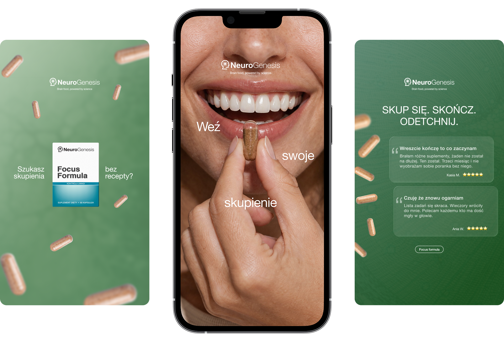
Soft greens, clean typography and restrained graphic elements extend the existing brand into a calmer, more coherent digital language.
 Sofii
Sofii
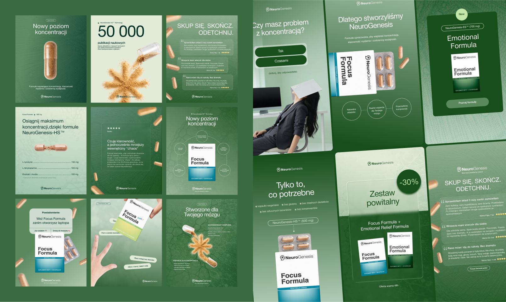
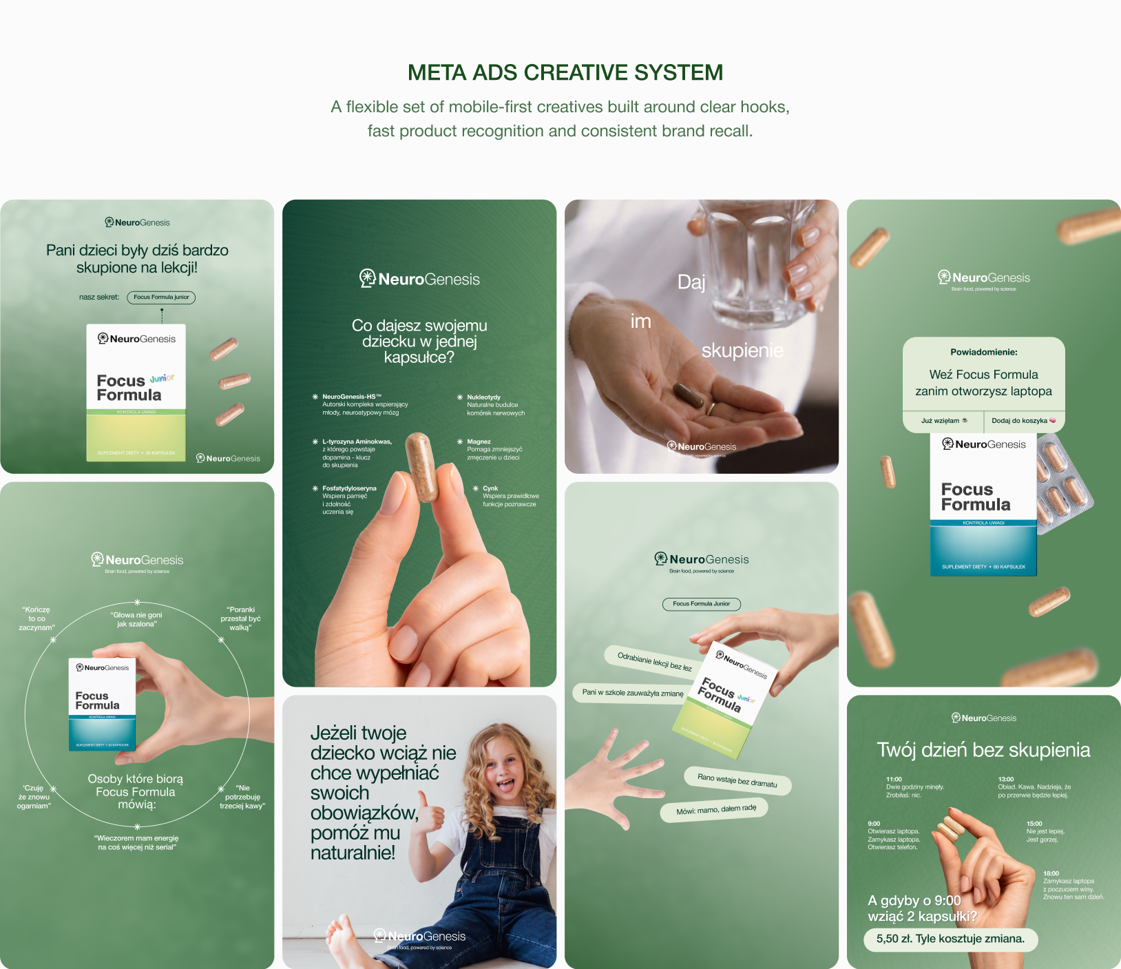
NeuroGenesis already had its logo and packaging. My role was to build the missing visual language around those assets and bring social media and paid advertising into one consistent, presentation-ready system that feels credible, calm and recognisable.
Soft greens, clean typography and restrained graphic elements extend the existing brand into a calmer, more coherent digital language.
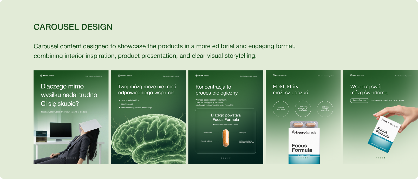
A shared grid, visual motif and typographic hierarchy bring product education, social content and paid creatives into one system.
The expanded identity supports Meta Ads, ongoing social communication and a future website direction without changing the existing logo or pack.